STORED Hassle free Storage & Moving
One of the largest Storage and Moving Company in the UK since more than a decade
Schedule Free ConsultationSTORED
In this case study, we will be looking at the revamp of a website that helps users book storage units for their personal belongings. The goal of the revamp was to simplify the booking process and create a more intuitive user interface that would make it easy for users to find what they need and complete the booking process in as little time as possible.
Tools
Figma, Figjam
Platforms
Website
Deliverables
UX Research, Interface Design, Prototype
Research
Secondary / Qualitative Research
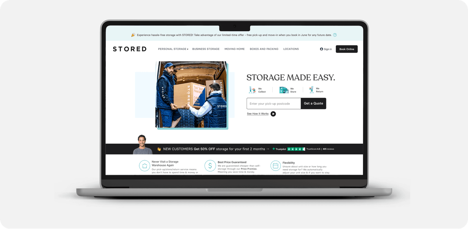
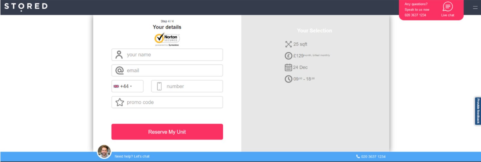
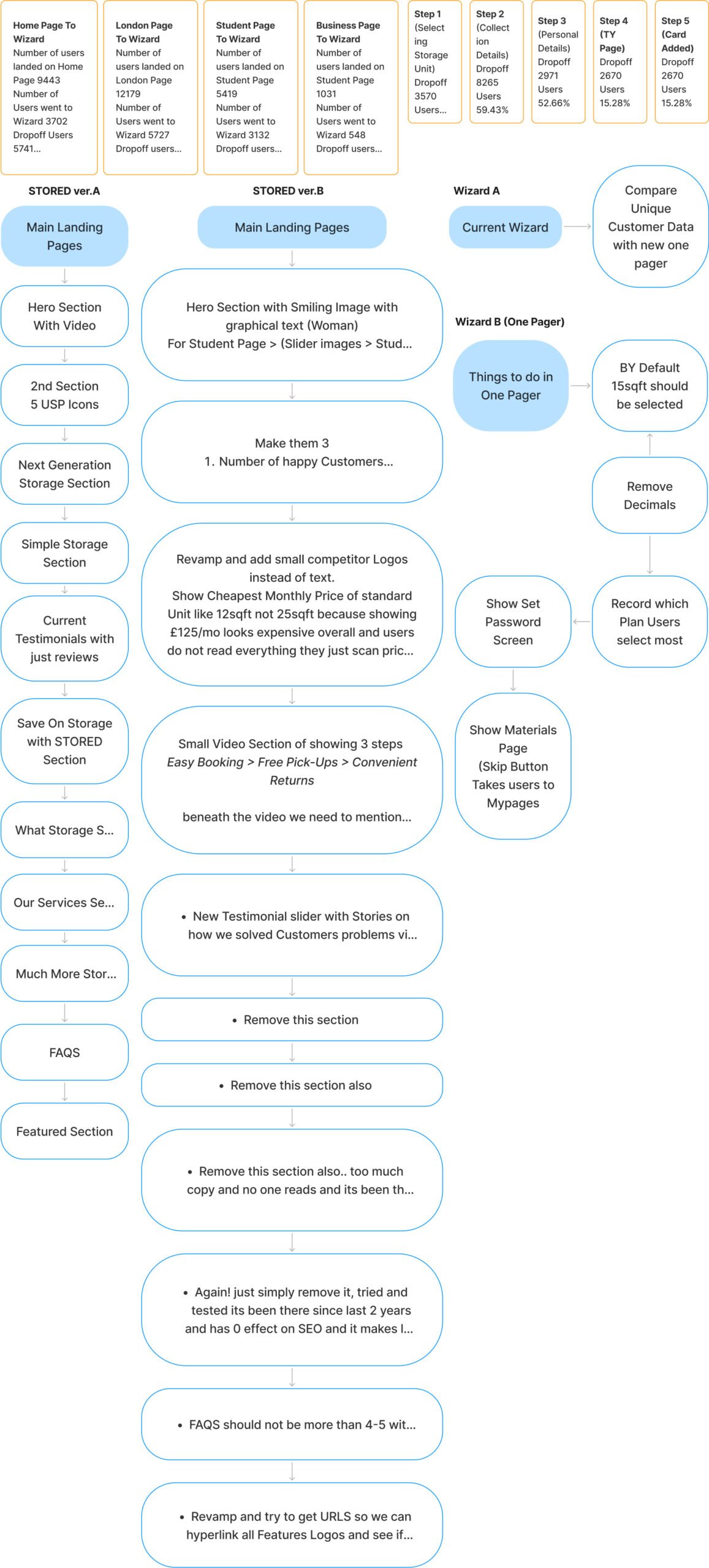
The original website had a booking wizard that required users to go through five different steps to book a storage unit. This made the process time-consuming and challenging, which resulted in a high bounce rate and a low conversion rate. The user interface was also outdated and not user-friendly, which added to the frustration of users trying to book a storage unit.

Understand Problem
Understanding of requirements to get the possible solution

Research
Do secondary research & qualitative research

Mood board
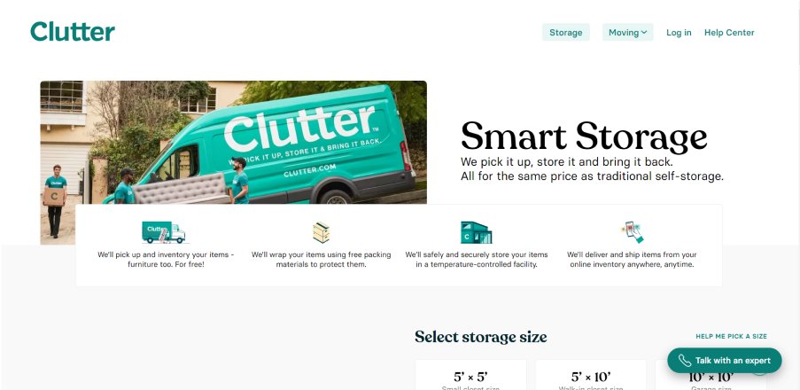
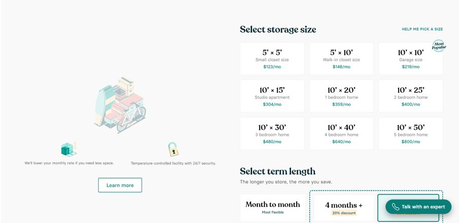
Create a mood board to get inspiration

Design & Prototype
Create high-fidelity design and prototype
The pain points that users faced with the original website included:
- 1
Complex booking wizard: The booking wizard required users to go through five different steps, which made the process time-consuming and frustrating.
- 2
Outdated user interface: The user interface was not very user-friendly, which added to the frustration of users trying to book a storage unit.
- 3
Lack of transparency: The original website did not provide users with enough information about the storage units, which made it difficult for them to make informed decisions about which unit to choose.
- 1
Users found the booking process too long and complicated, with too many steps.
- 2
Users struggled to find the information they needed about the storage units, which made it difficult for them to make an informed decision.
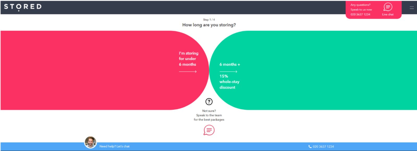
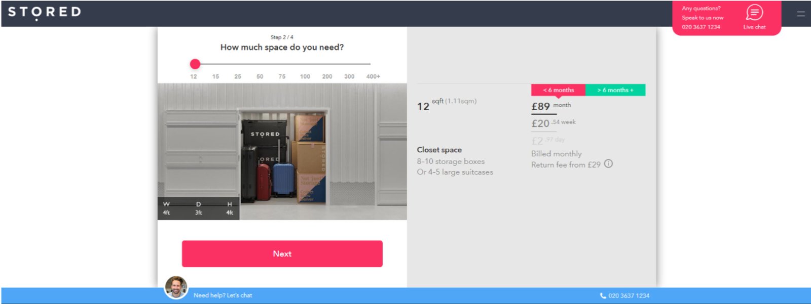
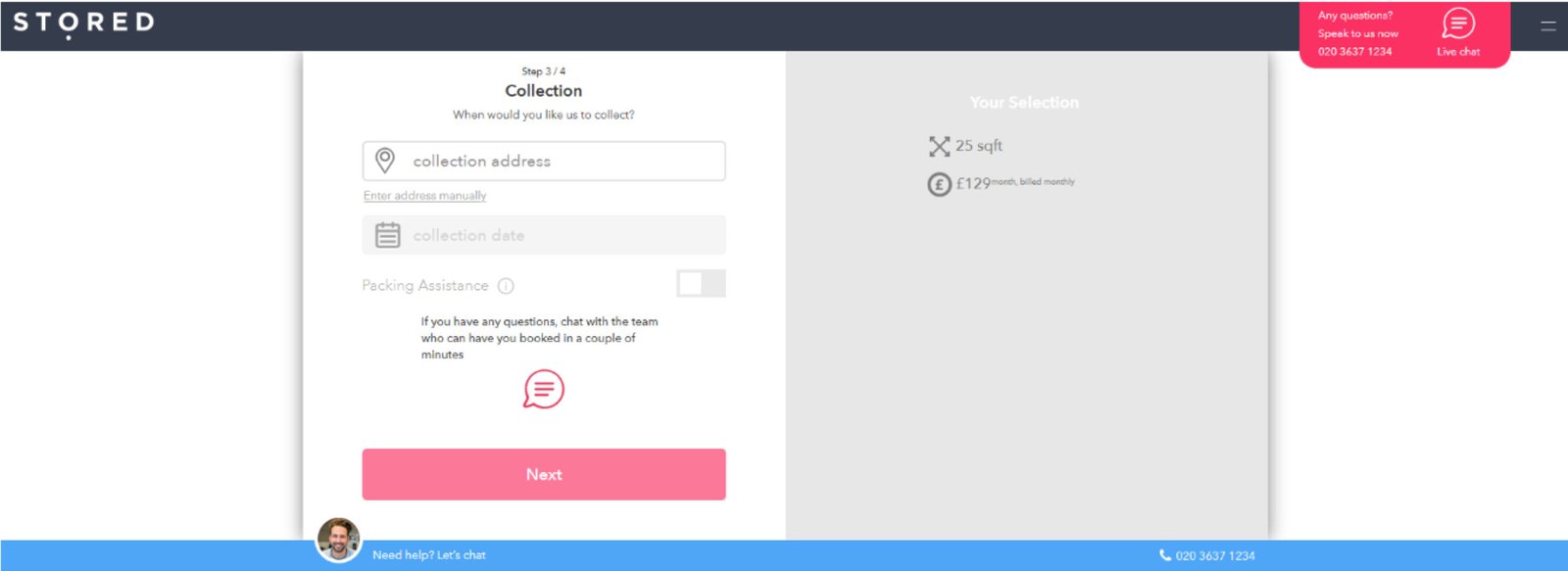
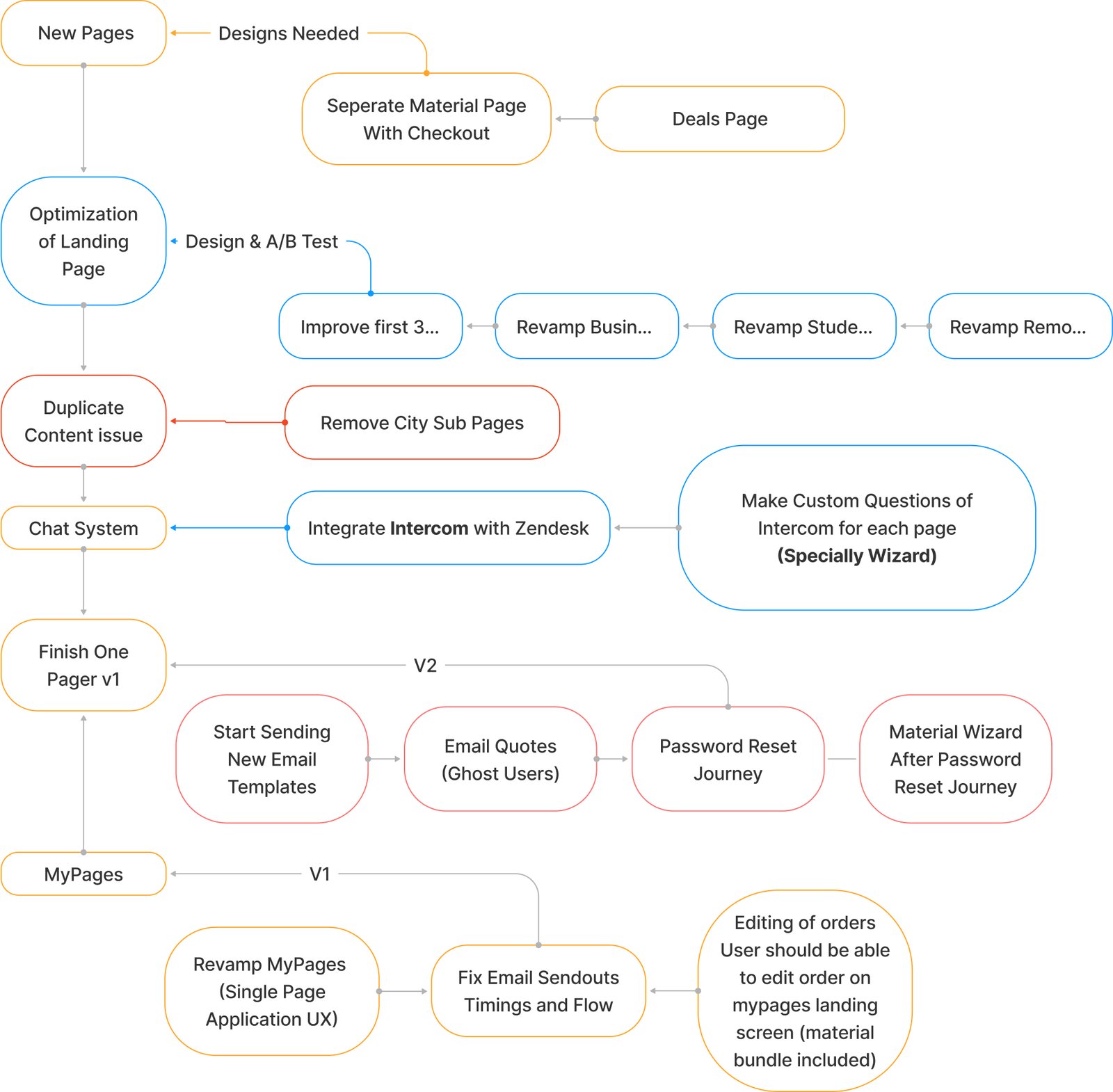
In order to address the pain points mentioned above, the revamp process focused on simplifying the booking process and creating a more intuitive user interface. The following changes were made:
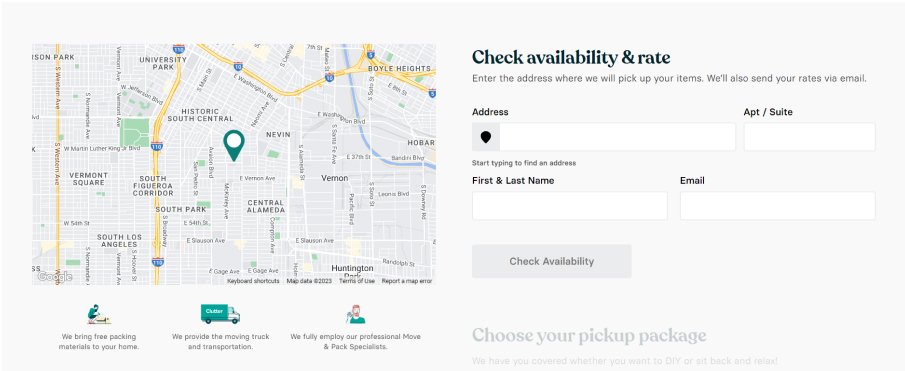
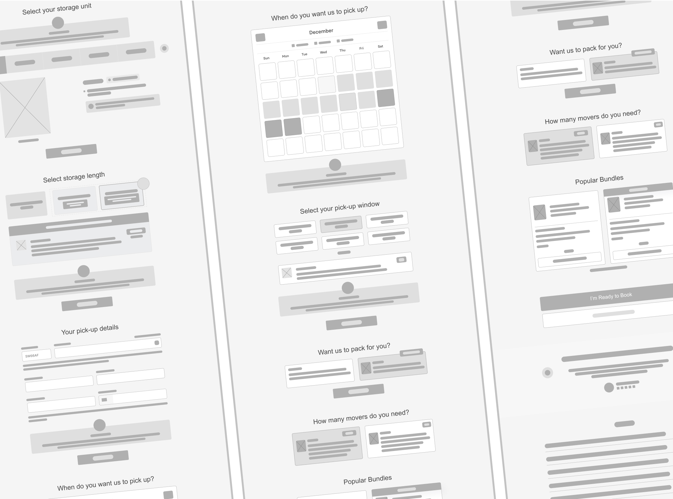
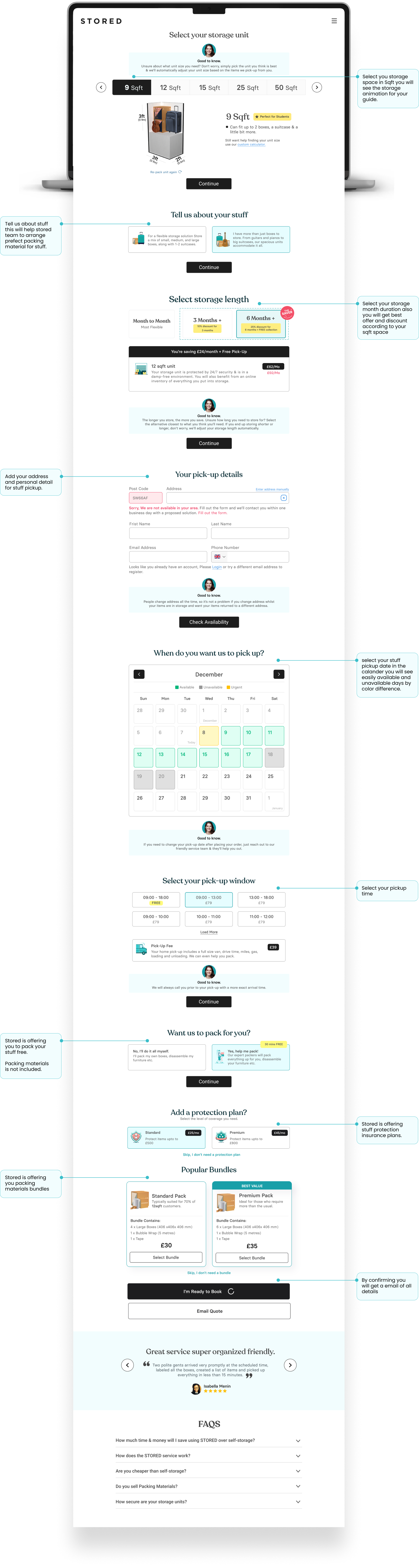
One-page booking process
The booking process was condensed into a single page, which made it much quicker and easier for users to complete.
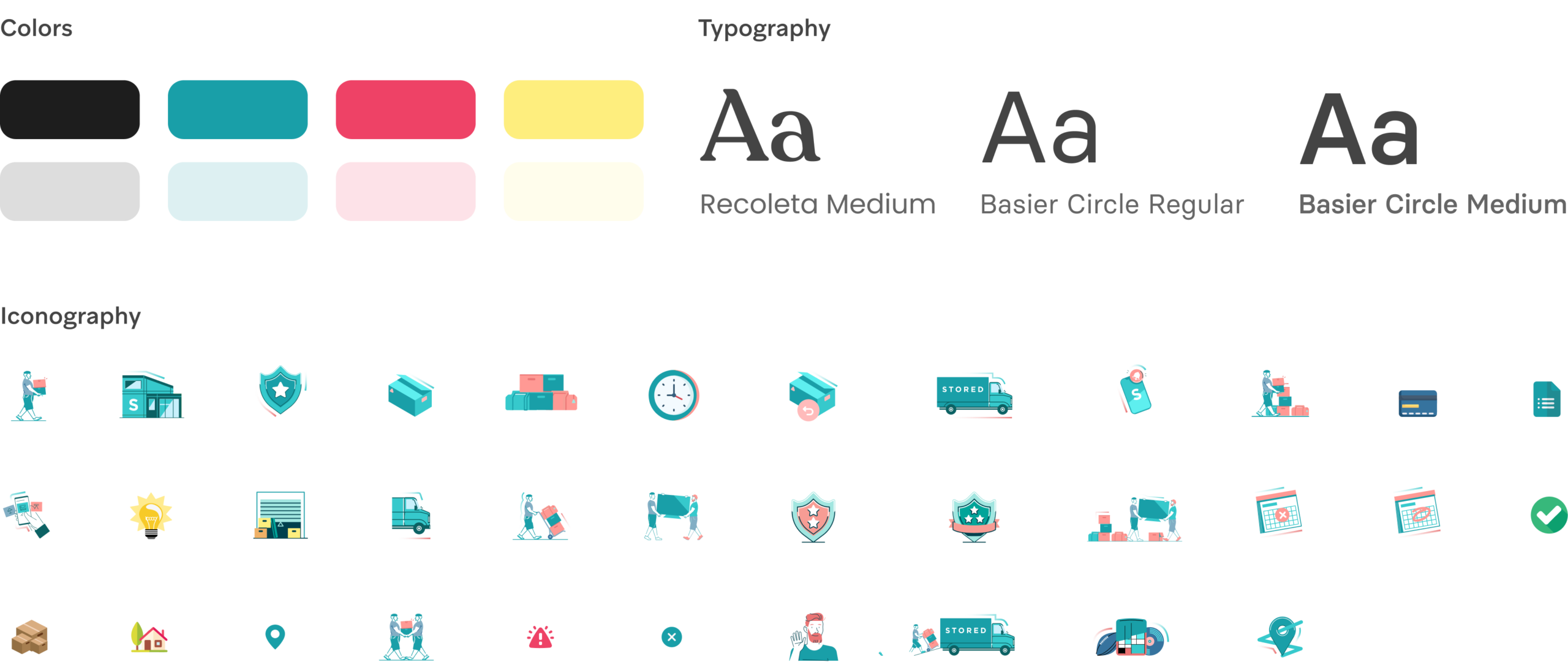
Modern user interface
The user interface was updated to be more modern and user-friendly, with clear and intuitive navigation that made it easy for users to find what they need.
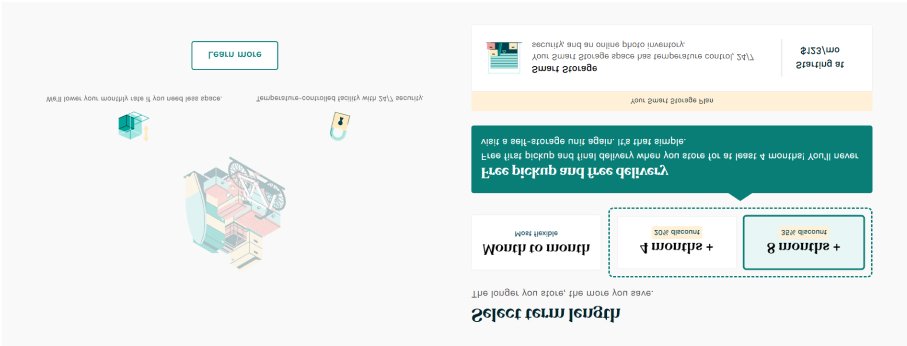
More information about storage units
The wizard was updated to provide users with more information about the storage units, including photos, dimensions, and amenities, which made it easier for them to make informed decisions about which unit to choose.
Outcome
The revamp of the website had a significant impact on the user experience and the business as a whole.
In conclusion, the revamp of the website had a significant impact on the user experience and the business as a whole. By simplifying the booking process, creating a more intuitive user interface, providing more information about storage units, and accepting more payment options, the website was able to increase conversions, reduce the bounce rate, and improve customer satisfaction and business metrics.
Let's bring your vision to life faster and smarter
Get a FREE Technical Consultation, Today!