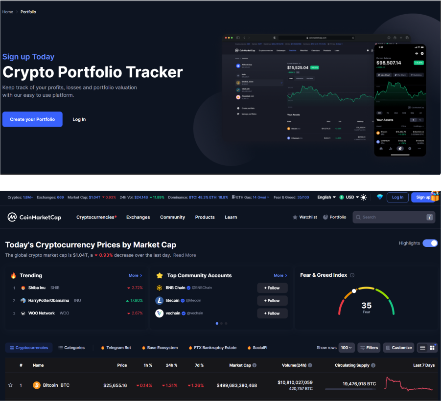
This case study highlights the improvements made to the user interface of WGMI dashboard which tracks users’ Non-Fungible Tokens (NFTs) and their associated traits. The solution involved complete revamping and implementing a sliding feature to display additional details when a user clicks on a specific NFT row.
Tools
Figma, Figjam
Platforms
Web Dashboard
Deliverables
UX Research, Interface Design, Prototype
Research
Secondary / Qualitative Research
Problem Statement
The original UI suffered from poor contrast and small font size, making it difficult for users to read and comprehend the information presented. Additionally, users found it frustrating when they couldn’t access the complete NFT information within the limited space provided.
Approach
Understand Problem
Understanding of requirements to get the possible solution
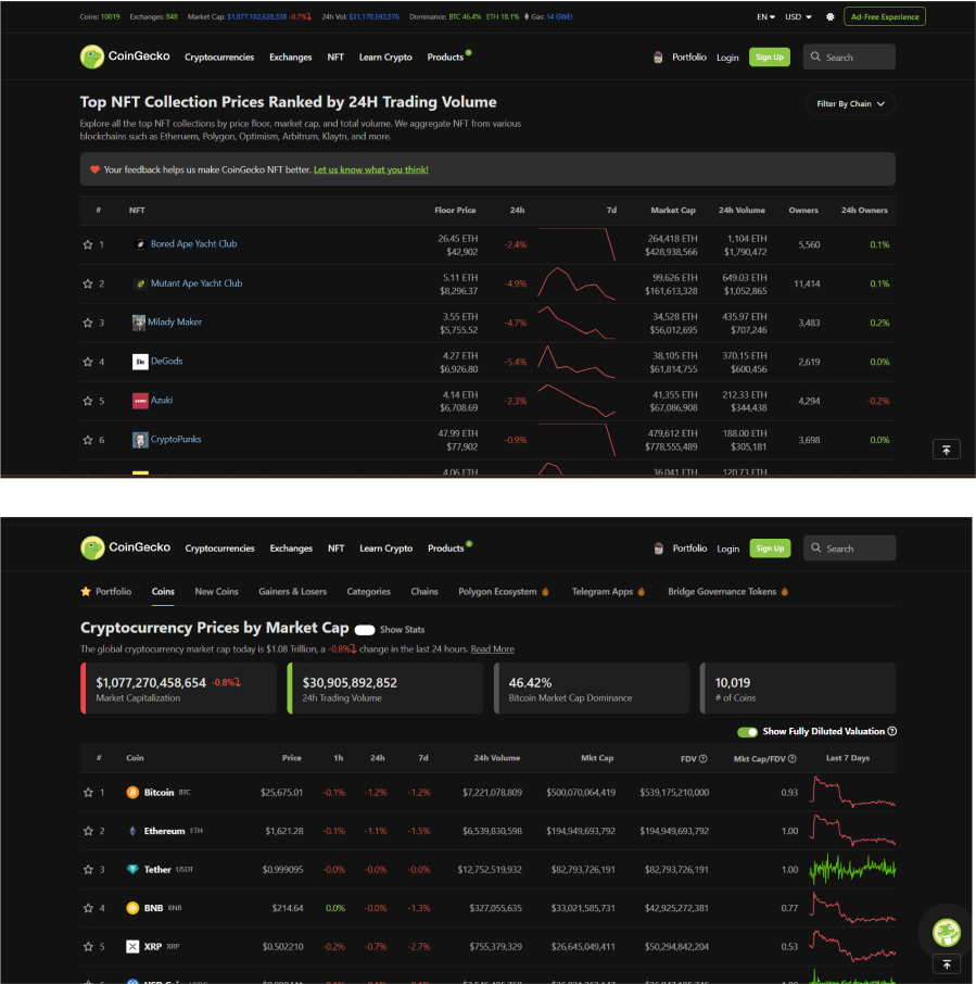
Research
Do secondary research & qualitative research
Mood board
Create a mood board to get inspiration
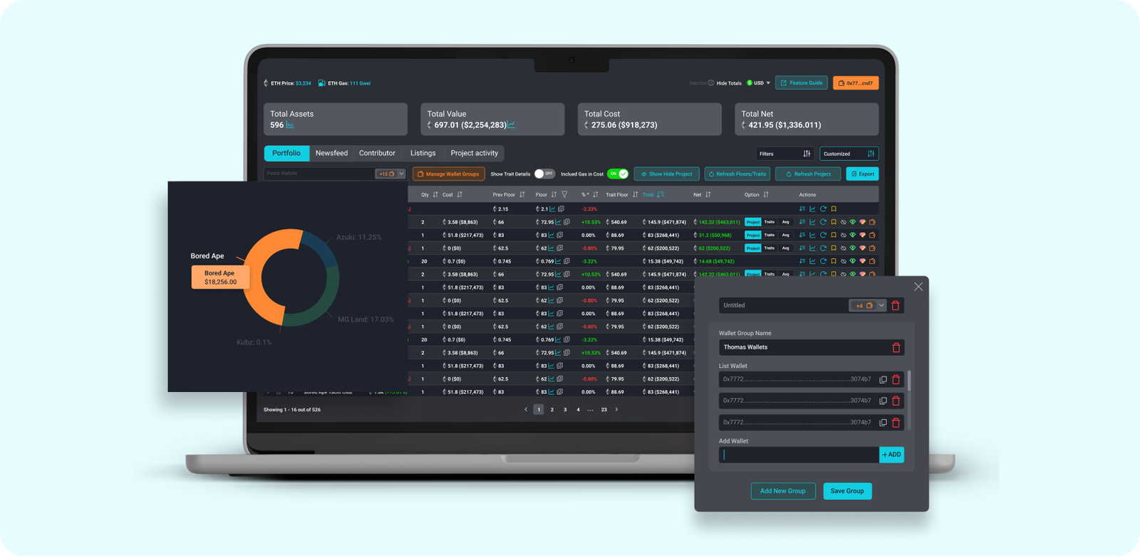
Design & Prototype
Create high-fidelity design and prototype
Research and Analysis
The original UI suffered from poor contrast and small font size, making it difficult for users to read and comprehend the information presented. Additionally, users found it frustrating when they couldn’t access the complete NFT information within the limited space provided.
Design Solution
To address the identified issues, the design solution focused on enhancing contrast, font size, and improving access to complete NFT information. The key design enhancements included:
Contrast Improvement: We increased the contrast between text and background elements to enhance readability. Darkening the background and using lighter text colors ensured better legibility and reduced eye strain for users.
Font Size Enhancement: We increased the font size throughout the dashboard to improve readability, especially for users who may have visual impairments or find smaller text challenging to read.
Sliding Feature for Expanded NFT Information: To provide users with complete NFT information, we implemented a sliding feature. When a user clicks on a specific NFT row, additional details and traits slide down, revealing a more comprehensive view of the NFT.
User Journey
Design Inspiration Mood Board
Low Fidelity Wireframes
UI Style Guide & Component Assets
Interface Design
NFT Portfolio List - Wallet Group
NFT Portfolio Chart View
Contirbutor Dashboard
Subscriber Newsfeed
Implementation and Feedback
After implementing the redesigned UI, we conducted usability tests and gathered feedback from a group of users. The feedback was overwhelmingly positive, with users expressing appreciation for the improved contrast and font size. They also found the sliding feature to be intuitive and user-friendly, enabling them to access complete NFT information without leaving the main dashboard view.
Conclusion
By addressing the issues of low contrast, small font size, and limited access to complete NFT information, we successfully improved the cleanliness, usability, and user experience of the crypto dashboard. The enhanced contrast and font size significantly improved readability, while the sliding feature provided users with easy access to complete NFT details. This case study highlights the importance of considering user feedback and continually refining UI/UX design to ensure optimal user experiences in the dynamic field of cryptocurrency management.
Contact us
Let’s bring your vision to life — faster and smarter
Get a FREE Technical Consultation, Today!